
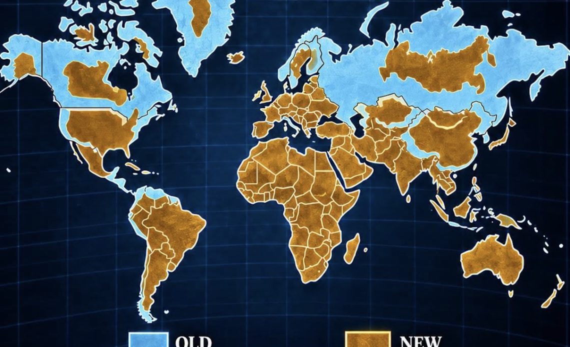
For half a millennium, the maps hanging in classrooms and printed in atlases have been quietly lying to us — not about where things are, but about how big they are. On September 4, 2026, the UN General Assembly voted 164–1 to adopt the “Correct the Map” resolution, encouraging the world to retire the 16th-century Mercator projection in favor of a modern one that shows continents and countries at something closer to their true size.
The story made headlines mostly for what it means for Africa, whose visual footprint on standard maps has been shrunk for centuries. But buried in the same resolution is a detail that matters just as much here in Borneo: Southeast Asia was named as one of the regions the old map has been quietly deflating all along.
The 1569 Map Everyone Still Uses
The map most of us grew up with — the one behind classroom projectors, in shipping charts, and still baked into the default view on plenty of digital map tools — is the Mercator projection, created by Flemish cartographer Gerardus Mercator in 1569. It was built for one job: helping sailors draw straight-line courses across open ocean. For that, it’s genuinely excellent, and it remains standard for marine and aerial navigation for exactly that reason.
But Mercator’s map does something strange to land the further it sits from the equator: it stretches it. Countries and islands near the poles balloon in size, while everything near the equator gets visually compressed. The most famous casualty is Greenland, which appears roughly the same size as Africa on a Mercator map. In reality, Africa is about 14 times larger than Greenland.
The UN resolution put the concern plainly, noting that the distortion “contributes to minimizing the perceived sizes of Africa, Latin America and South Asia, and perpetuating an unbalanced view of the world.” France’s foreign minister, Jean-Noël Barrot, went further, naming our part of the world directly: the United States, Russia, and China, he said, “take on a disproportionate visual prominence compared to Africa, Latin America or southeast Asia.”
Where Borneo Actually Sits
Here’s the twist for us: Borneo sits almost exactly on the equator, which means it’s one of the few large landmasses that Mercator doesn’t visually shrink or inflate much at all. The island is rendered at close to its true relative scale on the very map that’s been distorting everything north and south of it.
That doesn’t mean Borneo has been getting a fair shake, though. The problem isn’t the shape of the island on the map — it’s the reference points people use to judge its size. Most people compare unfamiliar places to familiar ones, and the familiar ones (Europe, the continental US, Canada) are exactly the landmasses Mercator has been quietly puffing up for 450 years. So even though Borneo itself sits roughly true-to-scale, it looks small by comparison — not because the island is small, but because the yardstick has been wrong.
How Big Is Borneo, Really?
Borneo covers roughly 743,000 square kilometers, making it the third-largest island in the world, after Greenland and New Guinea. To put that in terms that cut through the map distortion:
- Borneo is larger than every country in mainland Western Europe individually — bigger than France (about 551,000 km²), and more than three times the size of the United Kingdom.
- It’s larger than the US state of Texas (about 695,000 km²).
- It’s roughly the combined size of Germany and Poland.
- Its three nations — Malaysia (Sabah and Sarawak), Indonesia (Kalimantan), and Brunei — share an island bigger than most people’s entire mental map of “Southeast Asia” would suggest.
None of this is new information. It’s just information most people have never had reason to line up side by side, because the map they grew up with never invited the comparison.
A Map Correction, Not a Border Change
To be clear about what the UN vote actually does: the resolution is not legally binding, and it doesn’t ban the Mercator projection — it remains, as the Togolese government noted, “fully suited” for maritime and aerial navigation. What the resolution does is encourage schools, media organizations, and governments to adopt the Equal Earth projection, developed in 2018 by cartographers Tom Patterson, Bernhard Jenny, and Bojan Šavrič, for general-purpose world maps — the ones that shape how people picture the planet, not how ships steer across it.
Under Equal Earth, the visual shift is dramatic: Africa grows substantially, South America fills out, Europe and Greenland shrink back down to size, and Southeast Asia — Borneo included — reads at something closer to its true weight on the globe.
Why This Matters Beyond Cartography
Maps aren’t neutral, and they never have been. They shape which places feel “major” and which feel like an afterthought — which quietly shows up in how regions get covered in the news, how travel budgets get allocated, and even how seriously a place’s environmental or economic significance gets taken. Borneo holds some of the oldest rainforest on Earth, is home to orangutans found nowhere else on the planet, and its landmass alone dwarfs most of the countries people compare it to — yet it’s often treated, geographically, as a footnote.
The map is finally catching up to the reality. Borneo was never the small island in the corner of the world map. It just took 500 years, and a UN vote, for the cartography to admit it.
Sources: UN General Assembly “Correct the Map” resolution (adopted September 4, 2026); reporting from Al Jazeera, CNN, ABC News, NPR, and The Peninsula Qatar.


